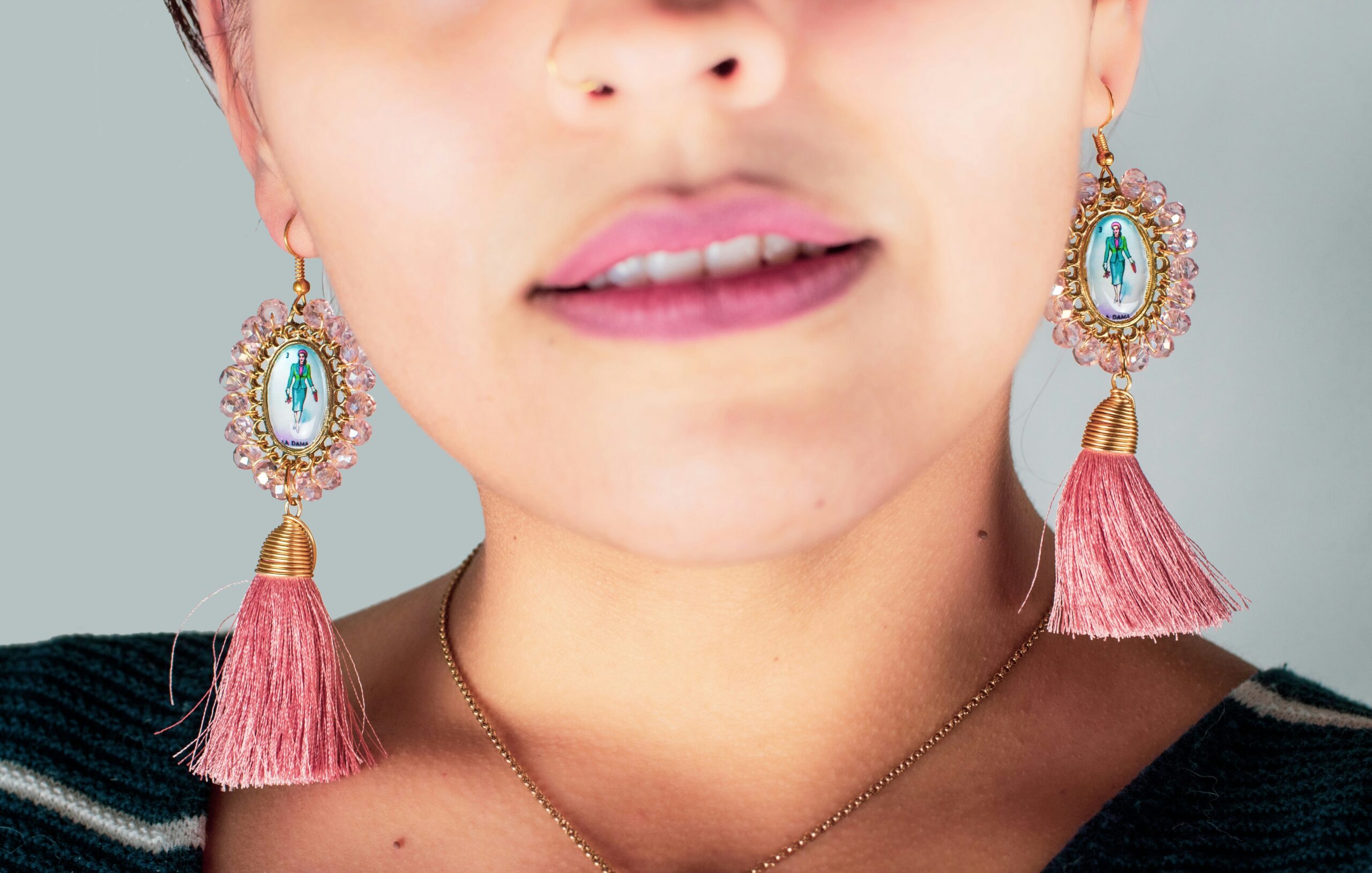
What is your style color vibe? Are you someone who likes to wear warm, advancing colors like red, orange and yellow? Or do you prefer cooler, receding hues like green, blue, and violet? We haven’t even touched on neutrals like black, white, brown, and gray yet, that will be an upcoming blog post! Check back soon.
The warmer the color the more energy and excitement comes with it. Imagine you’re on stage wearing a red dress or a red tie and the audience is going wild about the new product launch! You’re feeling the energy and so are they.
But, what if you were on stage and the goal was to calm the crowd with a serious new product development. The better choice would be to wear a blue dress or a blue tie. The cooler colors have a steady and mellow affect.
Without a doubt, this is a very basic example of warm and cool colors. There are numerous other factors that go into what to wear on stage, like a suit or separates for example. I will address these questions in an upcoming blog post. Stay tuned.
Essential Color Terms
Let’s review essential color terms that will significantly help you create stylish outfits daily. When we talk about color, there are three characteristics that are bundled together: temperature, value, and intensity.
Temperature is warm, cool, or neutral.
Value is the relative lightness or darkness of a color. A gray scale helps determined the value of a color. The value starts at 1 representing 100% black and ends at 10 representing 100% white. The values are light, medium and deep.
Intensity is the purity of a color which determines the relative brightness or dullness.
When it comes to clothing color, picking out the right one for you can be a fabulous and sometimes frustrating experience. When your outfit rocks the right colors, you’re feeling confident. When the colors are off, you’re feeling off too. In this blog post, we’ll go over color terms, harmonious color schemes and stylish color schemes. In subsequent blog posts, I’ll talk about choosing your best colors.
The next set of terms reference the intensity of color.
- Pure: Pure color, also known as bright.
- Tint: Color plus white, also known as pastels.
- Tone: Color plus gray, also known as muted.
- Tone (less known): Color mixed with complement, gentler with more energy.
- Shaded: Color plus black, also known as dark.
- Toasted: Color plus brown, also known as rich.
- Clear: Fresh and cheerful colors
You’ll know which colors work for you and which ones to leave behind during your next shopping trip. Shopping online is a little more challenging because digital colors are skewed.
Let’s chat next about harmonious color schemes.
Harmonious Color Schemes
Monochromatic – Using any tint, tone or shade of just one color. In clothing, varying textures add extra interest to a monochromatic outfit.
Analogous – Using colors that are adjacent to each other on the color wheel. In art, use at least two but no more than five consecutive colors on the wheel. When styling outfits use your best judgement as the more colors in an outfit lend a less formal look. Example: Yellow-green, green, blue-green, blue and blue-violet.
Complementary – Using any two colors directly opposite each other on the wheel. Example: Blue and orange or green and red.
Split Complementary – Using any color with two colors on each side of its complement. Example: Green with red-orange and red-violet.
Triad – Using three colors equally spaced from each other on wheel. Example: Orange, violet and green.
Tetrad – Using a combination of four colors on the wheel that are two sets of complements. Example: Blue and orange with red and green. Many times, we’ll see these types of color combinations in prints and patterns, like scarves and dresses.
Stylish Color Schemes
Tonal (tone-on-tone) – The use of two to three colors with medium to dark value or light to medium value. Choose from your intensity bracket – tones, shades, or toasted – and build into one outfit. Tonal dressing invokes elegance and sophistication.
Contrast (dramatic) – Combining a high value color with a low value color. Most common is black and white, but contrast can be accomplished with any color.
Blush tones (romantic) – A beautifully soft palette using pinks, creams, and light beiges to bring out a healthy and calm look.
Pastels – A color with white added, also known as a tint. Typically worn during the spring and summer months. Pastels have a youthful feel.
Neon – Extremely bright versions of primary and secondary colors. Neon colors are associated with fun and excitement. In fashion, they are primarily used for athleisure and activewear. Unless it’s for a specific work event, neon is not worn in the workplace.
Each of us is as individual as snowflakes! There are thousands of varying of skin tones, eye and hair colors in the world. All of them beautiful. In my experience, identifying the right colors for my skin tone was a little tricky, as my father has a very deep Mediterranean skin tone and my mother has a very light Nordic skin tone. The result is a neutral peachy tone with warmer hair and eye colors.
My best suggestion is to hire a professional color consultant who truly understands the nuances of color. I’ve been professionally trained in many color philosophies and it would be my pleasure to help you find the colors that make you shine. Go to the Contact Me page to connect.

Be the first to comment